
Why consistent stationery matters for day to day business
Stationery is often the first printed touchpoint a customer keeps in a drawer, files in a lever arch folder or passes to someone else. If the card uses one shade of blue, the letterhead another and the invoice book a third, the business can look patchy even when the service is good. Consistency gives people a clear sense that the business is organised and careful with the small details.
For mines, schools and local contractors in Rustenburg, stationery must also work under pressure. Quotes get copied, invoices travel between offices and order forms are handled by different people. When the layout, logo placement and contact details stay the same across every item, staff waste less time checking which version is correct. It also helps if you print in batches over time because the next run should match the last one as closely as possible.
A practical rule is to treat all stationery as one system, not as separate print jobs. The business card, letterhead, compliment slip, envelope, file cover and booklets should all use the same fonts, spacing and colours. Even a small shift in margins can make a clean design feel off. That is especially noticeable when one item is printed on bright white stock and another on a warmer shade, or when the logo is stretched to fill space.
Start with one master layout and build from that
The easiest way to keep stationery aligned is to begin with a master layout that is used for every item. This master should carry the exact logo size, approved colours, contact details, registration information and address format. Once that is set, each format can be adjusted for its own size without changing the core look.
For example, a letterhead may need more white space for typing, while a business card must fit the same details in a smaller area. The answer is not to invent new styling for each item. It is to keep the same structure and adapt the spacing carefully. That includes the same style of headings, the same line weight for borders and the same position of the logo whether the item is landscape or portrait.
We often see businesses in the Rustenburg CBD, Tlhabane and Phokeng using old print files that have been edited many times by different people. A phone number shifts, a footer drops lower or a logo gets replaced with a low quality image from a social post. It may look small on screen but on paper it shows up fast. Keeping one approved master file avoids that drift and saves money on rework.
What should stay the same across cards, letterheads and books
Some parts of stationery must not change from one item to the next. These are the details customers use to recognise your business and contact you. If those elements move around, the whole set feels inconsistent.
- Logo size and placement, especially on the top left or centred position
- Primary colours and any accent colour used for borders, headings or icons
- Font family and font weight for names, addresses and headings
- Company name format, registration details and VAT wording where needed
- Contact details and physical address formatting
- Spacing around the edges so the print does not feel cramped
Books need extra attention because they are handled more often and sometimes written on in a hurry. If you use invoice books, delivery books or order pads, the layout should leave enough room for signatures, dates, customer names and references. A crowded form slows people down and leads to mistakes. It also looks untidy when the copy is written over design elements.
Choosing paper, finish and print method for local conditions
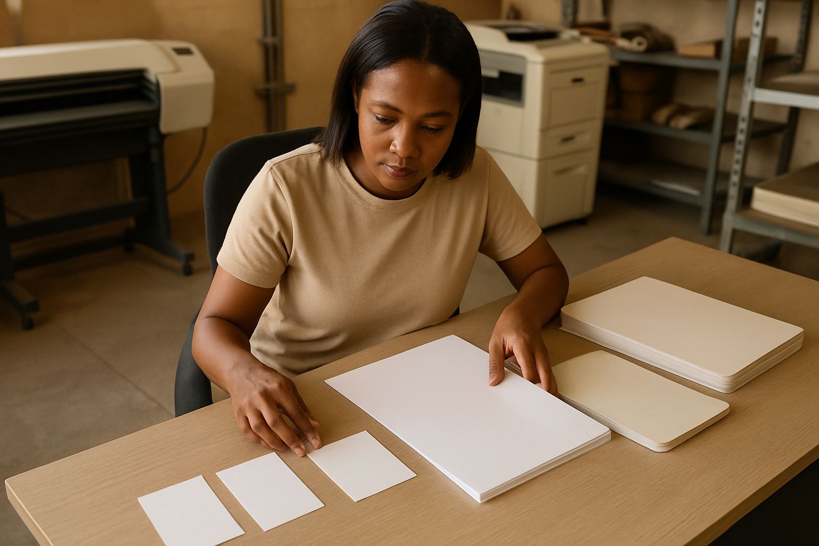
In North West conditions, paper choice matters more than many people expect. Heat, dust and frequent handling can cause cheaper paper to curl, mark easily or look worn before the end of the month. For office stationery, a good quality bond or smooth uncoated stock usually gives the best writing surface. For cards and covers, a heavier stock gives better feel and lasts longer in files and wallets.
If your business operates near the mines or in areas where paperwork travels between site and office, you need print that holds up under regular use. Letterheads should stay clean when signed or stamped. Book pages should not bleed through when copied by hand. Where stationery is kept for long periods, consistent storage also matters, so keep it away from moisture and direct sun. Coastal humidity is not a big issue in Rustenburg, but dust and heat are enough to affect stacks left open on shelves.
Finish is part of consistency too. If one batch is matt and the next is gloss, the set will not match even if the artwork is identical. The same applies to envelope windows, perforation on books and numbering style. It is better to choose one practical spec and keep it steady than to change every time someone asks for a small tweak. That kind of drift causes confusion, especially when several staff members order stationery at different times.
How to avoid mismatches when reordering
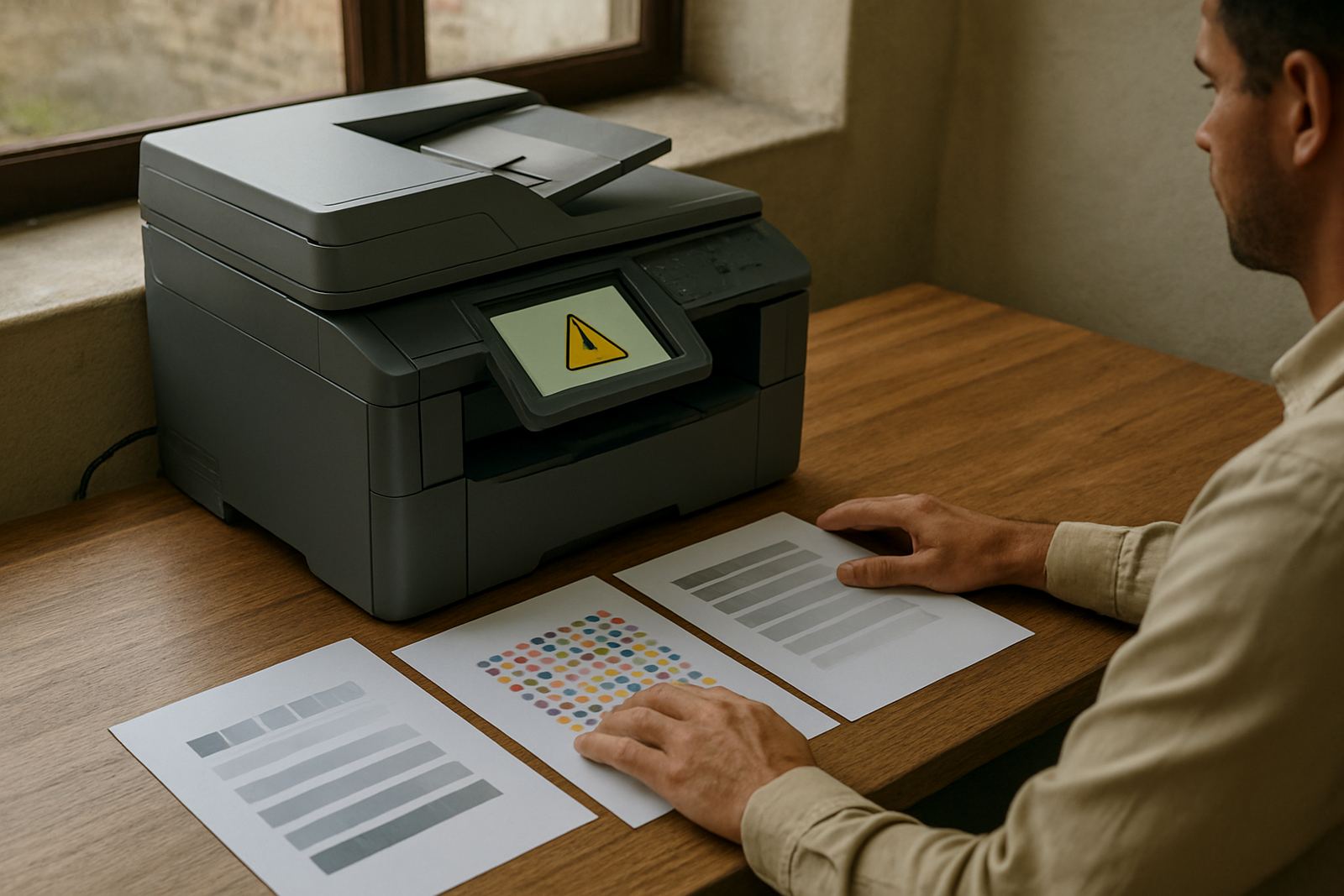
Reorders are where stationery usually goes off track. Someone finds an old card in a drawer, another person opens a file with an outdated letterhead and a third person asks for a fresh batch from memory. Before long, the business has three versions in circulation. The best fix is a simple approval system and a single file archive that names the exact item and revision.
Keep a short checklist for every reorder so nothing gets missed. This is especially useful for branch teams or businesses serving several sites across Bojanala.
- Check the contact details, address and spelling of names
- Confirm whether the same paper size and stock is being used
- Review the logo placement and colour values
- Match the current layout to the last approved version
- Confirm quantities for each department or branch
- Ask whether numbering, binding or perforation is still required
One Rustenburg contractor we worked with had separate order pads for site teams in Marikana and Mogwase. The forms looked similar but the footer details were different, so staff kept sending the wrong one to suppliers. Once the layout was standardised and each pad was clearly marked for the right team, order handling became quicker and fewer mistakes slipped through. Small system changes like that save time every week, not just on print day.
Stationery consistency for schools, mines and growing firms
Different organisations need different stationery, but the principle stays the same. Schools need clear letterheads, notices and record books that are easy for many staff members to use. Mines often need formal documents that pass between procurement, site supervisors and admin. Growing businesses need a look that can scale from a two page quote to a full set of branded forms without changing identity each time.
For a school in Rustenburg, consistent stationery helps with parent letters, sport notices and administration forms that go home with learners. For a mining supplier in Kroondal or Boshoek, it keeps quotations, delivery notes and purchase records tidy across departments. For a new business in the CBD, it builds trust from the first invoice. People notice if your paperwork looks sorted, and they notice even more when it does not.
Consistency also supports training. When new staff join, they learn one layout instead of trying to guess which version to use. That means less time spent correcting errors and more time getting work done. It may seem minor, but on busy days these details matter a lot. A clean stationery set helps the office move with less friction and fewer follow up questions.
A practical local example from Rustenburg CBD
A local supplier based in the Rustenburg CBD may start with a simple set: business cards, letterheads, quotation books and delivery notes. As orders grow, the team may add file covers, compliment slips and customer forms for different branches. If each item is designed separately, the result can become messy fast. But if the business keeps one approved visual system, every new item slots into place without needing a full redesign.
That approach works well for companies serving Tlhabane, Phokeng, Mogwase and the surrounding industrial areas. The same name, contact detail format and logo position can be used on cards for sales staff, books for the workshop and letterheads for admin. It saves time when reprinting after a stockout or staff change, and it makes life easier when municipal, school or supplier documents need to look professional and clear.
At Crystal Clear Printing, we see stationery as part of the working tools of a business, not just paper. When the set is planned properly, you get fewer errors, quicker reorders and a cleaner impression every time a client opens a file or receives a quote. That consistency is what keeps a local business looking organised day after day.