
Why PPE branding needs a site-first approach
In Rustenburg and across Bojanala, PPE is not only worn in the yard. It gets used on mine access roads, school maintenance jobs, warehouse floors and remote service points where dust, sun and daily handling are part of the job. That means branding has to hold up to movement, washing and the rough treatment that comes with site work.
Good PPE branding starts with the garment or safety item itself. A reflective vest for a night shift has very different needs from a cotton field shirt or a hard hat used by a supervisor moving between crews. The artwork size, the print method and the placement all need to match the way the item is worn, washed and stored. If the branding is too big it can crack, crease or affect comfort. If it is too small, it loses visibility and the team looks untidy.
For companies that need a professional site presence, the goal is simple: clear identification at a glance, without getting in the way of the work. That is why we look at the whole use case before we recommend a method.
Vests and high-visibility wear that stays readable
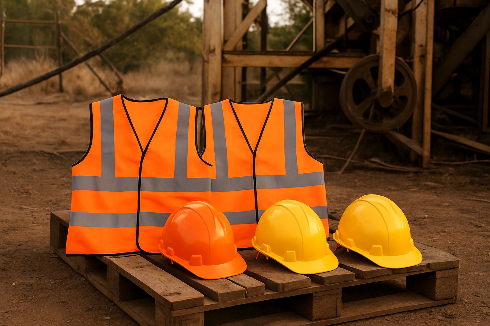
High-visibility vests are one of the most common PPE items to brand because they are worn by visitors, inspectors, drivers and site crews. The fabric is usually light and the garment often folds into a vehicle or toolbox, so the branding must be flexible and practical. We normally recommend clean front and back placement, with enough space around the reflective tape so the logo does not interfere with safety markings.
For active sites, smaller but clear branding often works better than a large full-chest layout. This helps the vest stay comfortable, keeps the reflective areas open, and makes it easier to replace an item later without changing the whole set. If the team works in dusty conditions around Rustenburg or on roads between Tlhabane and Marikana, a simple layout also stays legible for longer.
- Use bright, high-contrast logo colours where possible
- Keep branding away from reflective strips and seams
- Choose placement that remains visible when the vest is zipped or closed
- Match supervisor vests and visitor vests so the site looks organised
We also take washing into account. Vests that are cleaned regularly need branding that can handle repeated laundering without peeling at the edges or fading unevenly.
Hard hats, helmets and the limits of small surfaces
Hard hats and safety helmets are tricky because the surface is curved and the available space is limited. That means the logo has to be simplified and sized properly. On a hard hat, even a neat design can become unreadable if it is too detailed. For that reason, we advise using short names, clear icons or initials where a full logo would be too busy.
Placement matters too. The front is ideal for quick identification, but side branding is often useful when workers are seen in profile or when a site wants to separate contractors from permanent staff. In some cases, the back or rear quarter is the better option, especially if the helmet must keep compliance markings visible.
Rough handling and direct sun are common on North West sites, so the branding has to stay neat under heat and cleaning. For helmets used by supervisors, a small, sharp mark can be more effective than a full wrap. It keeps the look clean and it is easier to maintain if the fleet of PPE is updated in stages.
- Keep logos compact and easy to read from a distance
- Avoid overloading the helmet with too much text
- Leave compliance labels visible where required
- Use consistent placement across the team for quick recognition
Fieldwear, jackets and work shirts for daily use
Fieldwear takes more punishment than many people expect. Work shirts, jackets, dust coats and utility wear are washed often, exposed to sweat and exposed to weather changes in the same week. In Rustenburg, a morning can start cool and end in strong heat, so clothing needs to breathe, move and still carry the company identity.
Embroidery is often the preferred option on fieldwear because it looks tidy and holds up well on heavier fabric. It suits collars, chest panels and jacket fronts where the garment has enough structure to support stitching. For lighter shirts or softer materials, print methods can work too, depending on the fabric and the site conditions. We look at seam lines, pocket placement and whether the clothing needs to be worn under a harness or over other layers.
Good fieldwear branding supports the crew without making the garment stiff or uncomfortable. When the worker lifts, bends or reaches often, the logo should stay in place and the stitching should not pull at the fabric. For mine contractors, maintenance teams and school service crews, this is often the difference between a uniform that lasts and one that gets replaced too soon.
How to choose the right method for your site
The best branding method depends on how the item is used, how often it is washed and how much detail the artwork contains. A bold company name can work well on a vest, while a detailed emblem may need embroidery or a simplified print treatment on a shirt or jacket. If the work takes place near machinery, in wet weather or in dusty yards, durability becomes a bigger priority than decoration.
We also advise clients to think about their teams in practical groups. Visitors, supervisors, fitters, drivers and maintenance staff may all need the same brand but not the same layout. One department may need a small chest mark. Another may need a back print for site control. In larger operations across Bojanala, this kind of planning saves time when stock is issued and replaced.
- Choose embroidery for heavier garments and a more permanent finish
- Choose print for lighter items, larger graphics or fast turnaround
- Keep colour use simple so brand items can be produced consistently
- Plan for replacement stock so the team does not end up with mixed versions
Load shedding and production flow should be allowed for when the job is planned. If an order is urgent, clear artwork and approval early in the process makes the job easier to move through without last minute changes.
A Rustenburg example: clear PPE for a busy contractor team
A local contractor working between Rustenburg CBD, Phokeng and Marikana needed branded PPE for site supervisors, visiting technicians and store staff. The brief was straightforward: keep the team visible, make the clothing easy to issue, and keep the helmet marks simple enough to read in the field. The site had dust, early starts and frequent movement between vehicles and work areas.
We set up a practical mix of branding. Vests carried a simple front mark and a larger back identifier. Hard hats used short side branding so the compliance labels stayed visible. Field shirts were embroidered on the chest for a cleaner finish, while jackets carried a compact logo that would not interfere with zips or pockets. The result was a set of PPE items that looked consistent, was easy to assign to the right roles and stayed presentable after repeated use.
That is the kind of approach that works best in the North West. It is not about making every item look the same for the sake of it. It is about making sure the branding helps the site run better.
Ordering PPE branding with less back and forth
When you are ordering PPE branding for a live site, the easiest projects are the ones with clear sizes, quantities and item types from the start. If you already know whether you need vests, hats, jackets or mixed fieldwear, the production path becomes much simpler. It also helps to send the correct artwork in one go so the layout can be checked before production begins.
For businesses in Rustenburg, Tlhabane, Kroondal, Boshoek, Mooinooi, Mogwase and the wider Bojanala area, we handle the practical side of the job from artwork setup through to delivery and setup where needed. That includes embroidered garments, printed PPE, fitment on site where required and repeat orders for growing teams. If you are equipping one crew or several branches, it helps to keep the branding rules consistent from the start.
Practical PPE branding is not complicated when the plan is right. Use the correct method for the material, keep the layout readable and make sure the final item can survive the way the team actually works.